Tuesday, 1 December 2009

Mike Rigby - Words of Wisdom - 26/11/09

Mike Rigby is a Graphic designer who came in to give us a few words of wisdom about his life as a graphic designer and what we should come to expect when we leave University. 

What stood out straight away to me as he showed us his contents page was that he was going to discuss his experience of taking a break and going abroad, and how that opened more doors for him. I think this caught my attention as this had been a decision I have been thinking about, whether to travel first or get experience first, and this lecture to some extent answered my question.

Another part of the talk that stood out for me is the way he described being a designer, that it wasn't a job it was a lifestyle choice. And I remembered I had heard this somewhere before, Craig Oldham from Music had said this before in his talk, which is also mentioned in my blog.

Mike talked to us about placements, and how they 'speed you up'. This is by working on real projects, networking and going on free nights out! He mentioned going out and being sociable is key to getting to know other designers. Advice that I think went down very well!

It was when Mike was talking about what he did when he first received a brief, then using a quote from Ray Gregory he said "What is it that I've been asked to do?" then something clicked. He showed us examples of briefs he was given as a student then what he did to answer them. 

He said the brief was to come up with a different design to sell underlay. "So how do you sell something invisible?" he said. Make underlay desirable. And then thats when he thought of the heart packaging.
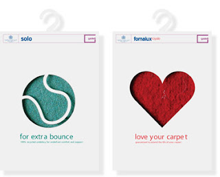
It was then after the lecture that I had a look at both my Tolerance and Ted Baker briefs and things that hadn't stood out before suddenly became apparent! 

I really enjoyed seeing where he had been abroad, I hadn't really been to a lecture before about graphic design where they also went into detail about their travels and where they'd been, Thailand, New Zealand and such places are where I have been thinking about traveling too so it has encouraged me to stick with that plan.

He also encouraged us to create self initiated projects, as being a designer is a lifestyle. 

But he also mentioned that it is essential to have a life outside design too, 

"The more interesting life is outside of design, the better at design you will be." - Mike Rigby

Tolerance Research and Idea Development

For the Tolerance and brief, me and my work colleague Mike wanted to develop one of our ideas that we hadn't cracked yet we thought the concept worked. A reminder of the tolerance brief is that Manchester City Council want to have a month long festival and have the meaning of tolerance promoted to the people of Manchester. We came up with the concept 'count to ten' where when ones tolerance is tested, sometimes counting to ten is a technique people use to calm down. We thought about how we could portray this visually, and so this is an idea we came up with.


We didn't think this was really showing what we wanted to say, and additionally it could be made visually better. We also wanted more versions of it to relate to different situations people had to tolerate. It was proving difficult and so we decided to raid the library for inspiration. This is where I saw this work in the D&AD annual 2006. This is just a sample of 5 posters that were created from 10. To view the other five then they are on this website http://awards.dandad.org/2006/categories/prsa/press-advertising/09194/words-come-alive


D&AD Awards 2006
Words Come Alive -
Press Advertising / Newspaper Press Advertising Colour

Typographical elements had been used and in-distorted in anyway to show an idea. The strap line linked to the Typography symbols brings the idea to life. This made me think that we could use this technique, and make our posters as simple as posters and edit the strap line to bring the idea to life.

With this is mind we designed a series of posters.


These ideas still need to be simplified and edited, for instance the Clock may need a re-think as it additionally uses the numbers 11 and 12. But through research we have been able to push the idea further and find direction with this concept again.

Ted Baker and Stop Frame Animation Research

A brief I am working on currently with my work colleague Sophie is a campaign for Ted Baker for the launch of their Autumn/Winter collections. 

As part of the campaign the store windows should be used as the primary vehicle. What the brief is asking for is something to grab peoples attention, and by this we could even ignore the fact that it is Autumn completely. It needed to be scale-able, simple to understand, must capture the British sense of humour and project Quirkiness. 

One of our main ideas was to use British idioms, that we thought are British, Quirky, can be made strong visually and can specific idioms can be linked to weather. Initially we began visualizing such idioms as 'Raining cats and dogs' 'A penny for your thoughts' and 'Bakers Dozen' , but this lead onto another idea. 'Blown Away' by Ted Baker.


The idea was to have mannequins in the shop window but have them on a slant, infront of a huge fan (that would be hidden) to show them fighting against the wind. The clothes would be blown so the viewer can also see the inside of the garment, something you usually wouldnt see on static mannequins. 

In the Background we thought of having a projection of things blowing in the wind. Either a shopping trolly, an old lady, even someone on rollerblades with a newspaper in their face. We thought this would be something humorous to add to the window, and the viewer would be more inclined to stick around and see what was going to blow past next. 


This lead on to even more research and ideas as to how we could present this, and the technique of stop frame animation presented itself. Making something blow naturally across the screen proved tricky in filming, and so with research in to stop frame animation this seemed like a really interesting concept that seems like it would work well with our idea.

We decided to research into campaigns and performances that had used stop frame animation so we got a better idea of what to do. Here are some of the things we found. I find all of the se remarkable and mind boggling as to how much time it would had taken to stop-frame each one. It still seems exciting to have a go at doing this ourselves.


"Get out and play" 2008 - The Human Snake


New ad by Big Yellow using stop frame animation. Directed by Dougal Wilson. Animation Director Drew Lightfoot. Agency CHI & Partners.


Norman McLaren's famous Acadamy Award winning stop action animation from 1952.


Human Skateboard by PES. Directed by PES. Commercial for Sneaux Shoes. Advertising Agency: Margeotes, Fertitta & Partners, New York.

Osbert Parker. Film Noir (excerpt, short film 2005).