Showing posts with label Research. Show all posts

Friday, 7 May 2010

Lonsto - Queue management company

My idea for the major project - Organ Donation - swiftly changed to the idea of waiting. The organ donation queue is the most extreme and dangerous form of queueing though not alot of people know it. Over 10,000 people are currently waiting in this queue and 3 people a day die whilst waiting. One of my ways to show this is to use a ticket dispenser to dispense tickets that show the extremity of this by showing a number in the 10000s when someone takes it.

I wanted it to look as real as possible, so nothing else will do apart from an actual ticket dispenser. I also knew I would need good photography and so I got in touch with Lonsto (Lonsto.co.uk) a company that sells products to enhance queue management.

We were in touch for quite some time discussing my project and they were very helpful, and sent me lots of good photography of their products.


We then continued to discuss how I could purchase a dispenser from them, as it was only companies that had accounts with them. They seemed interested by my project and so came to arrangements on the price, and they also threw in some tickets for free!!


Thursday, 15 April 2010

clever advertising

Just a few ambient pieces that caught my attention!


Print Finishes

I am coming to the last few weeks of my project, and have completely changed the direction I am going with my work. 

These are the very first mock ups of the idea that I am going to do. 


The idea is focusing on how people who are waiting for an organ donor have to wait, and they might not even get an organ.

As I have only 2 weeks to produce the finished piece, I am starting research into different ways to print so I am ready to sort it when the time comes.
In Computer Arts Magazine July 2009 (pages 48 - 51) it shows 15 treatments you can use on your work to give it a great finish. 
The different treatments are:
Die Cut - Simply the process of cutting and shaping.
Varnish - Applied to work to protect scuffing and enhance visual effect.
Spot UV - Ultraviolet varnishing that really lifts colours out.
Emboss - Creation of a 3- dimensional design.
Deboss - 3 - dimensional images by depressing the print.
Silk - screening - Brings a unique aesthetic to print work.
Foil Blocking - Involves a coloured foil being pressed onto the print.
French Folding - A combination of horizontal and vertical folds.
Flock - Expensive. Printing in adhesive rather than ink.
Overprinting - Printing colours over each other so they interfere.
Holographic foil - To emphasise other colours around it.
Mirror foil - Applied as a hot foil.

The one that appeals to me is the varnish finish, where it will enhance my poster prints when they are completed.

www.Toxel.com

The website Toxel.com is a site I was introduced to by a fellow peer at University. As soon as I accessed the site I knew I was going to be on it for a while. The first image I saw was 'Costume made out of mirrors' that I instantly thought was unique and probably amazing to see in reality.


As I scrolled down and noticed 'Popular Posts' where there would be more of this stuff, I knew I wanted to see if they had examples of unique billboards. 

Fortunately they did, and so I spent a good while looking at all the billboards they had to show. Here are some of my favourites:

The Economist Billboard

Nike Billboard. 

I think this is clever however I would probably run right into it!


The Slingshot Billboard

IKEA Billboard

Miele Vacuum Cleaner Billboard

Formula Toothcare Billboard


I really recommend this site for anyone creative to have a look at.

Wednesday, 14 April 2010

Typography Research

I have always been curious about typography. How it works, what it works with best, which typface to go with a certain medium, the list goes on and on.

Over the past year I have used 'Rosewood' with shop windows, 'Helvetica Neue' on posters, and 'Goudy Sans' with punctuation. I still think I need to study more with type. Here are my favourite examples of great use of typography.


www.graphicdesignblog.org
www.alexbinetti.files.wordpress.com
www.graphicdesignblog.org

www.ilustrasiaurora.co.cc

www.blog.blastyle.com

www.gentlepurespace.com

www.images.trendhunter.com

Monday, 15 March 2010

Direct Mail and Guerrilla Research

I am up to a stage in my Major Project on Organ Donation where I feel like I have the idea, it just needs to be taken now in different directions to work. Before I started to think about this, I felt like I needed to look at the many different great and unique examples of direct mail and guerilla there are out there. Here are the best examples I have found:


Tuesday, 2 February 2010

What does everyone else like? Ad campaign research

Recently researching ad campaigns and coming to my own opinions on which caught my attention and why, I suddenly was curious to what ads were noticed by other people, whether it was print, TV, guerrilla, anything. I asked around to find out.

Dane - “Quite an iconic English image and works well with an iconic English brand, looks really thought out. And I like meat.”


Colmans ‘Proper Mustard’ by Karmarama
“Colman's uses a meat-based mock-up of the famous First World War army recruitment poster featuring Lord Kitchener in its new ad campaign.
Colman’s is targeting males to persuade them that its mustard brand is the best accompaniment to meat.” (www.campaignlive.co.uk)

Jenny - "I just basically imagined what everyone went through behind the scenes of making it - plus its different and makes you ask the question is that real? have they done that digitally? ... when i found out it was for real, it gave it that extra charm!"

TV Ad - The Fallon London

Matt - "Even if you don't want to admit it, you do end up like that at the end of the night sometimes, so it makes you want not to be like that."


Mike - "because they were different, and surreal"

VW Jetta "Big Day" wedding commercial


Grace - "thought they were quite funny. its unusual to see eggs committing suicide... and the strapline works well with the ads, think its ul miss them when there gone or something."


Andy - "the idea was not to forget your butter when u make jacket potatoes and things like that, and they all had yellow post-it notes on the food instead of butter, but they looked like butter at first glance"


Lurpak Brand. From D&AD Annual 2003 pg 58. BMP DDB

Mccan Erickson - “Coffee isn’t my Cup of Tea” – www.mccan.co.uk

Mccan Erickson are “commited to creating the perfect blend of creativity, effectiveness and innovation that will help grow the brands in our care.” They pride themselves to get the right advertising solution for all their Clients’ brands. (And along the way we quite like to have some fun doing it.)

Cultural Connections

This is a philosophy that Mccan Erickson use. It is an idea that plugs a brand into culture. They are ideas that cause a reaction and make a brand relevant in peoples’ lives.

PRINT

MSF (Medecins Sans Frontieres)

MSF are an independent humanitarian medical aid organisation. They are committed to providing medical aid where is most needed, regardless of race, religion, politics or gender.  “Our new campaign shows fading photo imagery of MSF medics to demonstrate how thinly the staff are stretched and breadth of work undertaken.” (www.mccan.co.uk)


Heinz Salad Cream

This advertising campaign won awards including a Gold and Silver Epica, and ran this campaign over the summer of 2007. They say on their website (www.mccan.co.uk) “The iconic Salad Cream bottle takes the role of the sun, graphically illustrating how the sauce brightens the food below.”


Heinz Tomato Ketchup

“‘Sliced bottle’ and Bottle Botttom’ ran as a poster and press ads from May 2007. ‘Sliced Bottle’ was a multi- award winning, scooping an Epica, a Gramia, a FAB, and Campaigns Best Poster of 2007.”
(www.mccan.co.uk)

TV

Shreddies Charles – “Knitting Nanas”

I didn’t know Erikkson Mccan made this advert so I was pleased to find it on the website as I think this advert was unique and a great idea when I saw it. 

Monday, 25 January 2010

Advertisement Campaigns

As part of our Major project for the final year at University, we are asked to create our own brief. When creating the brief, we need to bare in mind that whatever we decide to do, it has to be something that we want to focus on when we enter the industry after graduating.

Something that catches my attention and that I admire are advertisement campaigns, on issues that are big in the present news or from the past. I find it remarkable how if this issue is advertised well, then it can change someone perception of it instantly and even change their opinion of it.

I think, to be able to do this would be a challenge but I'd very much like to achieve it. Therefore, I have chosen to use this as the foundation for my Major Project.


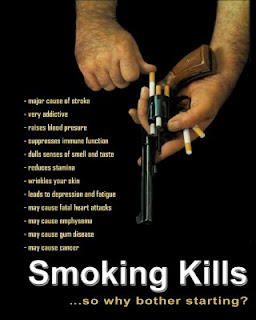
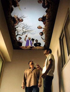
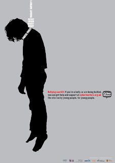
Saatchi and Saatchi


http://www.itsyourlifefoundation.org/anti-smoking_posters
http://www.guardian.co.uk/media/2009/mar/24/joe-calzaghe-bullying


Tuesday, 1 December 2009

Tolerance Research and Idea Development

For the Tolerance and brief, me and my work colleague Mike wanted to develop one of our ideas that we hadn't cracked yet we thought the concept worked. A reminder of the tolerance brief is that Manchester City Council want to have a month long festival and have the meaning of tolerance promoted to the people of Manchester. We came up with the concept 'count to ten' where when ones tolerance is tested, sometimes counting to ten is a technique people use to calm down. We thought about how we could portray this visually, and so this is an idea we came up with.


We didn't think this was really showing what we wanted to say, and additionally it could be made visually better. We also wanted more versions of it to relate to different situations people had to tolerate. It was proving difficult and so we decided to raid the library for inspiration. This is where I saw this work in the D&AD annual 2006. This is just a sample of 5 posters that were created from 10. To view the other five then they are on this website http://awards.dandad.org/2006/categories/prsa/press-advertising/09194/words-come-alive


D&AD Awards 2006
Words Come Alive -
Press Advertising / Newspaper Press Advertising Colour

Typographical elements had been used and in-distorted in anyway to show an idea. The strap line linked to the Typography symbols brings the idea to life. This made me think that we could use this technique, and make our posters as simple as posters and edit the strap line to bring the idea to life.

With this is mind we designed a series of posters.


These ideas still need to be simplified and edited, for instance the Clock may need a re-think as it additionally uses the numbers 11 and 12. But through research we have been able to push the idea further and find direction with this concept again.