Thursday, 15 April 2010
Mick Greer
Thursday, 11 March 2010
Alan Cocks - Graphic Designer
Lauren Moriarty
 Geometric Structure Cushion (http://www.laurenmoriarty.co.uk)
Friday, 5 March 2010
Shell Suit Zombie 1/3/10

I hope to see more of Shellsuit Zombie in the future, perhaps at D&AD New Blood.
Thursday, 4 March 2010
Magpie Design Studio
Tuesday, 2 February 2010
Mccan Erickson - “Coffee isn’t my Cup of Tea” – www.mccan.co.uk
Mccan Erickson are “commited to creating the perfect blend of creativity, effectiveness and innovation that will help grow the brands in our care.” They pride themselves to get the right advertising solution for all their Clients’ brands. (And along the way we quite like to have some fun doing it.)
Cultural Connections
This is a philosophy that Mccan Erickson use. It is an idea that plugs a brand into culture. They are ideas that cause a reaction and make a brand relevant in peoples’ lives.
PRINT
MSF (Medecins Sans Frontieres)
MSF are an independent humanitarian medical aid organisation. They are committed to providing medical aid where is most needed, regardless of race, religion, politics or gender. “Our new campaign shows fading photo imagery of MSF medics to demonstrate how thinly the staff are stretched and breadth of work undertaken.” (www.mccan.co.uk)
Heinz Salad Cream
This advertising campaign won awards including a Gold and Silver Epica, and ran this campaign over the summer of 2007. They say on their website (www.mccan.co.uk) “The iconic Salad Cream bottle takes the role of the sun, graphically illustrating how the sauce brightens the food below.”
Heinz Tomato Ketchup
“‘Sliced bottle’ and Bottle Botttom’ ran as a poster and press ads from May 2007. ‘Sliced Bottle’ was a multi- award winning, scooping an Epica, a Gramia, a FAB, and Campaigns Best Poster of 2007.” (www.mccan.co.uk)
TV
Shreddies Charles – “Knitting Nanas”
I didn’t know Erikkson Mccan made this advert so I was pleased to find it on the website as I think this advert was unique and a great idea when I saw it. 
Tuesday, 1 December 2009
Mike Rigby - Words of Wisdom - 26/11/09
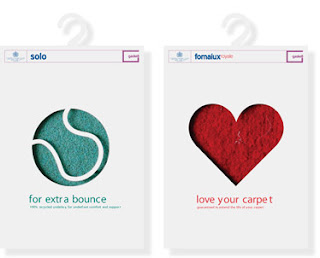
He said the brief was to come up with a different design to sell underlay. "So how do you sell something invisible?" he said. Make underlay desirable. And then thats when he thought of the heart packaging.
Thursday, 5 November 2009
Container Plus
In the talk I was sat next to one of my really good friends who is studying moving image, but we had recently decided to work on a brief together which was to design a campaign including a design for shop window for Ted Baker. Ironically as Louise started her talk she said how her company started out in the beginning, herself and her good friend Nicola illustrated a window of Selfridges, and it is from this they realised they worked well together.
As she discussed their projects, it became clear that they worked well with sets as well as illustration, and the visuals were amazing. I especially liked the work they did for the Volkswagen Car Launch where they were given 4 rooms in a house to design themselves, and she said it was "a 360 degree experience."
She also said something that I feel is very important and it is something I try and do, it is always to try and be nice to the people you work with, and they will help you out when you need it.
The process she discussed when they created their project 'Evil Twins' is something I have noted down and I think me and my friend are going to use as inspiration for our project.
She said to firstly create a story/concept and then that can be taken to any scene such as a park. Also its the use of sets and props that made me think this is the perfect way of thinking for our project. And that photographs and sets can be edited and changed on photoshop and so it is never limiting.
What became apparent in the talk was how important it is that you test a collaboration before you're committed to it. Louise and her team realised that is was 3 people they found a good combination, and then have assistants who help them.
This way by using techniques as simple as just having a conversation led them to their great ideas.
After the talk me and my friend wanted to learn more, and ask for some advice on our window display project. We discussed with Louise our process, and she agreed it was a good idea to come up with the story/concept then go along with whatever comes from that. I think we had started to discuss how we were going to present an idea whereas we shouldn't really had been doing that already. Additionally Louise stated to treat the Window like a stage, and imagine the performance that is going to take place on that stage... "how are you going to use the space? are you going to stick anything on the glass? is there going to be something there that involves the public like an event?"
She also kindly gave us a list of artists to research that might help us out.
Ovarall a very informative and entertaining talk with a very positive outcome.
Dave Sedgwick from 999
From listening to Dave it started to become clear that it was very important to research as many design agencies as you can whilst still in University, and keep a diary of your progress with each one...and that this diary was to be shown to no-one!
And when it was time to visit each agency with a portfolio, it was really important to take each comment with a pinch of salt, as some designers are going to love it, and some are going to hate it. Dave mentioned that one company even said he 'needed some Yorkshire pudding packaging added'.
This was Ironic as he actually got a placement with this company later on. He outlined the important issue that if you work hard, you will be successful, as that what he did and managed to get jobs with big company's such as LOVE and Dinosaur.
Even when it didn't work out with these places, he gained confidence from the experience and new skills he had learned and eventually through work that he freelanced he managed to gain publicity and build up a client base. He stressed that in the end 'it is all about who you know.'
Dave additionally gave us tips and advice about how to get a job. What I learnt was to not contact a few agencies I liked but to get a list of agencies and call and enquire about who to send CV'S, PDF'S and emails to, and email as many as possible. When you go for an interview he mentioned to perhaps leave a 'leave behind' before you go, which did not occur to me before to do but is a really good idea.
From learning and hearing from designers coming in to talk to us I always noticed how they stressed the point that it is definitally hard work to get a job and Dave even said one post graduate he talked to had 32 interviews before she got a job!
I came away from this talk with the desire to get list after list of contacts and with more determination than ever!
Thursday, 7 May 2009
Practitioners report - Music and Fake ID
The second visit from Music was from Craig Oldham. He started his talk off with a 'parental warning' on the screen saying that he is going to swear, but “that is just how it goes” he stated, so I knew this talk by Music was going to probably be even more outgoing than the first. Craig had not been out of University for that long, so he wanted to give us an outline of facts of what to expect when we did leave. He explained that he could just see two words explaining 'Graphic Design' and these were 'Emotional' and 'Logical'. Things like logos for toilet doors and symbols are logical, whilst practitioners such as David Carson are emotional with their work.


This leads me on to my second practitioner I am going to discuss, Yvan Martinez and Joshua Trees from Fake ID, who are in my eyes without doubt emotional designers too. Currently in its tenth year, Fake I.D. has produced a diverse range of work, recognized in numerous books and magazines, including commissions from Aiwa, Anthropologie, COLORS and Emigre. Stockport College was privileged to have these designers come and visit us, for a 1-day workshop and a lecture/performance. Working with Yvan and Joshua on the project named LSTN (Line, Sound, Text, Noise) made me realize that these designers were in fact more emotional in the work they produced. In the talk they delivered they discussed some of their ideas, and that some of the work they produced was '4th wall' between audience and performance, and breaking this ‘4th wall’ would create interaction between audience and performance. One of the memorable quotes I can remember from the talk was when Joshua described some of the things that occurred when they started designing saying, "The line between Art and Life disappears".
This results in creating a link between these designers, and the designers at Music. Both agencies undertake independent projects. I remember when Craig was showing us his work he showed us a typeface that he had created independently and not for any company but just because "it was in my head, so I put it down on paper". He then went on to say something quite inspiring, which was "Graphic Design is a job. A designer is a lifestyle choice." Therefore it shouldn't be something you do it should be who you are. And I’m sure Yvan and Joshua at Fake ID would agree. Their whole lecture was not about their work, that they said "you can view that anytime on our site". The 'performance' was something I had not really seen before, and it was a good way to end the year off by seeing something different. It was another independent project that they shared with students that could be used as inspiration for commissioned work.
Hearing what these practitioners have to say has enlightened me and even changed the way I think about my own work. I have always found it difficult in past briefs to organize images and type on a page so it looks dynamic, you could say in a similar way to the works of David Carson. Sometimes, I have found that I cannot place something in a peculiar way, as it just doesn’t seem logical. However, after Craig’s lecture I realized that I was perhaps in fact just a logical designer, and more of a problem solver. That is just in the design process though, I am quite an imaginative and emotional person, and my work has sometimes even been described as ‘surreal’ for instance in conceptual studies, I think it is just when putting pen to paper my logical thinking takes over.
As both design practitioners each do independent studies as well as commissioned work, this has made me want to begin my own projects on the side. I think this would be a good idea as it shows that you’re not just doing it as a job, it is because you enjoy it.
When I went to visit Anthony at the Music studios he asked me what I would like to see in a piece of Graphic Design, and I replied that I like to see a great idea, one that get a reaction from the viewer either emotional or comical, and he agreed. Fake ID was similar in what they wanted to see from us when we started the workshop with them. The brief was to write a narrative accompanying an image, and at first I was just seeing the image and almost started to describe it. However, this wasn’t what they wanted to see and told me to take what I was seeing at the moment, but pushing it further, perhaps even rewinding and imagining a beginning to the story that I was currently imagining. With this is mind I started to think of more ideas, and it had great results. The idea I created was something that would not have been thought of if it had not been pushed, and so this is a process I am going to apply to my work in the future.
(1013 Words)
Monday, 4 May 2009
FAKE-ID Workshop
"In May 2009, the second workshop will investigate the 'voice-over' as an invisible yet influential communication device, to be conducted at Stockport College in Manchester, England. Sonic experiences (audio books, cinema soundtracks, mobile media, podcasts, real-time announcements, vlogs, and voice-activated technologies) are increasingly augmenting our lives. Participants are challenged to script, perform and record a voice-over for contemporary life."
And so our class divided in pairs, and we were each given a picture. And with this picture we were to script a two minute voice over that influences what is being seen according to what is being said.
Myself and my Uni work friend were given a picture of countryside and country road, with a billboard in the centre right saying 'Hell is Real'.

At first we did not quite know what to do with the image, but as soon as my Uni colleague said "news reporter" an idea came into my head.
We then started to script a helicopter report covering a crash that had just taken place below them, on a country road. And how it unfolds.
It didn't take long to write the script, I think you have just got to let go and imagine your there, and then the words just write themselves.
Here is what we came up with (read in "panicked news reporter voice"):
"Thanks everyone there in the studio
From what I can see from up here there is what seems to be a rather large shipping lorry that has overturned and is now in the middle of the road and this seems to be the main course of the hold up on the A623…
We have just heard from witnesses on the ground that have said that a Nissan car was weaving in and out of traffic, causing cars and the lorry to steer out of the way …and from what I can see the chaos created is ...there is just wreckage and an outstanding quantityof cars either overturned or mounted on top of each other, prayers with the families of those involved with the collision..
Reports are coming in that the lorry itself was travelling at great speed which caused it to overturn that caused the consequences of the crash, the crash itself has caused major delays and a back log of cars for what I can see from here…stretches miles back
As this is the main Highway leading into the next state there have been reports that several of the cars in the backlog havelooked for their own diversions, possibly in order to get away from the hold up, but please if you are listening to this report then we advise you to stay in your vehicles and STAY WHERE YOU ARE. If you know of friends and family that may be involved in the crash then ring 0800 900 300 and we will give you news as it comes to us
Emergency services are on their way to remove the lorry and let the traffic continue by.
Breaking news! We are hearing of people running away from what looks like a tank exploding in the middle of the chaos area, we do not know how this started we ….we remind you if you are not involved in the main crash site to stay where you are, do NOT take diversions just yet we do not know whether you will be safe
This really Is a quite horrific crash and we will keep you updated with the news as it comes, back to you in the studio…"
I think what I most got out of this workshop were several things. I learned to
1/ Think outside the box, don't describe what I see describe what I see around it.
2/ Script writing - imagining I am there, therefore what I would say.
3/ Performing the script. Not an actress but felt like I did the script justice!
A very educational and enjoyable day!!
Talk by Craig from Music
The first one is
"Always accept criticsm and never praise"
The second
"Let external forces inspire your design work"
And finally
"Graphic Desin is a job, a Designer is a lifestyle choice"
It was great to hear from someone who had not been out of University that long, but who also would be honest with us students, even if sometimes very honest, as to what we should expect when we leave.
I really enjoyed listening to his 12-step approach and I made a few notes.
1/ What is Graphic Design? The two words that Craig said he thinks IS Graphic Deisgn is Logical and Emotional. And I agree. As to which one I am, I know the emotional one appeals to me more as I would think of myself as quite an emotional person, though I can't help thinking Im more logical in the work I deliver. Perhaps I am just a bit of both.
2/ Strengths and Weaknesses.
I think one of my strengths is my imagination, and I'm learning not to ignore it when I think an idea is too much. My Weakness is typography, and making it look dynamic on a page. But I'm learning!
3/ Your portfolio being the most subjective thing you will ever design.
Yes I agree, and as mine currently stands with most of Craigs "Pet Peeves" (people holding up posters, lots of type) I made changes to that last week - hardly any type, no people!
4/ Placements - why you should and why you shouldn't.
This is what I was worried about, but since visiting Music and Love I'm not so worried anymore. I make cups of tea at my current place of work, they are very popular! Score.
5/ Make contacts/friends/Build bridges.
Before I met Music in their studio I was slightly anxious and wasn't sure what to expect, but I found walking around Manchester with no phone and A to Z stressful but...I enjoyed it? Starting to realise that I'm enjoying the stress and that has surprised me. Also asked Anthony at Music for contacts that lead me to Adam at Love and I'm enjoying meeting new people.
6/ Never Blockade Ideas, ask people. Be open.
I've started doing this more since Craigs talk, and it works!
7/ Record things. 3rd quote listed above.
I don't do enough of this, but plan on changing that very soon.
8/ TRIAL AND ERROR.
I have much experience in this area. Must..keep..going..
9/ Things are happeing all over the country in Manchester, Leeds, Edinburgh, Cornwall, Birmingham, NOT JUST LONDON.
10/ Design is 20% of your job.
11/ Let life inspire you design.
Craigs 5 stages I plan on putting into practice.
12/ Work hard and be nice to people.
I'm a nice person..and I want to give all my all to Graphic Design once I leave University.
I definitely came away from this talk with a better idea of what to expect and the best way to act when first working in an agency. I also came away from the talk with a quick intention to fix my portfolio as soon as possible, cloning hands holding my posters and getting rid of type came to mind!!!
Wednesday, 18 March 2009
Rick Poynor Lecture at Sheffield Hallam University
Rick Poynor
Rick Poynor is a design historian and and founder of Eye Magazine and I had the privelage to see him speak at Sheffield Hallam University.
Here are some of the things that he had to say when critically analysing editorials and spreads created by other designers.
He says he sees a monograph as a 'problematic editorial idea' and that monographs are arising many questions and asks the question 'Are monographs a good vehicle for critical analysis? And continues, on a whole, no as it depends on the editorial thinking and design thinking.
His talk was divided into chapters for analysis, and here are few of the notes I made:
1) The Art monograph as a model.
The first few spreads that we saw it was clearly visible that they were more presented for function rather than design. It was clear we were seeing a presentation of the progression of dynamic design on a page.
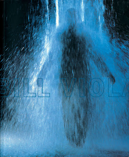
Bill Viola Exhibition Catalogue for the Whitney Museum of American Art. Front cover. Des. Rebeca Mendez
2) The monograph of self interpretation.
The design of a book is a self regarding project to undertake - like a mirror. David Carson is a classic example of self interpretation, using type as a material to play with. It may look aesthetically pleasing but does not show subject and purpose of a magazine.
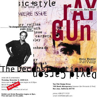 Poynor says that he thinks Sagmeister are current stars of today and that Die Gestaltung Verlag like to take chances on young designers producing monographs.
3) The monograph as self documentation.
Document work has great thoroughness and clarity, or should have this anyway. Paula Scher is not an experimentalist and produced 'Make it Bigger', which is a great example of self documentation. You start to feel what the work is like. Clear and intelligent.
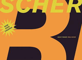
Paula Scher "Make it Bigger".Princeton Architectural Press.
4) The monograph as independent study.
Some spreads can look old fashioned and plain. Poynor suggests the use of smaller books, as they're less expensive but still get the point across. They are small impressionistic overviews and are working commercially.
5)The future of the design monograph?
Poynor says the time that is put in to create a monograph is no worth the money that is given for it. If it is not a success then publishers lose money. He expresses how he thinks Irma Boom is a strong and determined designer. Abstract details do her immersive quality, and is a justification in an Art book.
 Otto Trueman, Spread of pages. Des. Irma Boom.
In a monograph it is important to strike the balance between editorial purpose and design as an expression. Wim Crouwel designer gives an example of a good monograph, with two big images and then a smaller one to reinforce the point.
What have I learnt from this lecture?
That it is very important to get it right when it comes to designing monographs. When creating editorials and the subject and text should be clear, then it should not be messed with too much. By Poynor showing examples of successful monographs in his eyes as well as the not so successful ones, it has given me a better idea of what to do next time I design an editorial or spread.
Thursday, 12 March 2009
Mario Sanchez
A fine arts graduate, he currently lives in Spain and studies illustration, he is well-known for his photo manipulations.
He uses a variety of different mediums, like for example digital painting, vectors or 3D. Sometimes he starts work on Analogue formats and finishes them in digital, or vice versa.
"His habitual line features hyper realistic together with surreal and contemporary dark art touches" (http://aegis-strife.net)
I'm a big fan of surrealism, and Salvador Dali. So when I came across Mario Sanchez' work on www.smashingmagazine.com I instantly became a fan. I could look at these images for hours. I think when I go into the graphic design industry I will probably use surrealism as an inspiration, and I would look back at artists like Sanchez as an influence on my work.

"The Carnival is over." Happiness leaves a wasteland.
 "Monument of Non Existence" collaboration with Oana Cambrea
Reality Clash.
Alberto Seveso


A me mi piace la gnocca!
Studio 8

Asked to recover the critically aclaimed 'The Art Atlas'
 Posters created named 'Breathe' to raise awareness of the destruction of the Amazon rainforest.
Studio 8 commissioned to design an annual report of 'Circus Space' in 2006
Monday, 2 March 2009
Glorious came to visit
Karl's Barbershop
The owner of one of Manchester's last traditional gentleman's barbers wanted something special when celebrating 40
years in business.

I thought this guerilla/ambient media was a really good idea, when you pulled it out the part in the middle looked like it was spinning, like the symbol that is placed outside a barber shop does.
The font for 'reddog' caught my eye. It shows that to create a successful logo it does not have to use professional typography, you can just place an existing font in illustrator and draw around it, to create this font

and this logo

Lastly, their 'Make me C' campaign using typography out of tools and appliances I thought was really impressive. The typography is unique and each tool for each letter really works, here is the logo that Glorious created.

Thursday, 5 February 2009
Thoughtfuls' Guide to Pitching
I think it is important to remember that the Advertising buisness is exploitive and THEY tell YOU what to change, which I think would be quite difficult when you've spent weeks working on an idea that you personally really like.
Additionally, pitching is not a competition, it is a way of getting closer to your client.
Something that I think I will definitely have to work on in the near future is to ask more questions when I am presented with a brief, even if I don't have any particular question in mind. This shows the client that I am interested in what their company and what they are asking me to do.
Some more key information I thought was important was:
1) Do a Cover sheet
2) Break your ideas down
3) Show how it is flexible
4) Rehearse presentation and make shaw it is flawless
5) End with a Thankyou
6) Be ready for questions (Do your research!!)
Wednesday, 4 February 2009
Graphic Design: Fine Art of Social Science?
1/ To be a good graphic design is has to be appropriate to the context and communication in all areas.
2/ Graphic design should be discussed in all visual styles, not just posters and books.
3/ Graphic design needs to communicate with the public with its ideas and issues, it should not just aesthetically please.
4/ Modern avante guarde typography is an example of how typographic deisgns during this period were more abstract and aesthetic that communicating its ideas and being appropriate.
I came to the conclusion that in order to succeed in its aim and communicate ideas then Graphic design is not or should not be a Fine art.
Tuesday, 9 December 2008
Fudge
Fudge said that when they received a brief they did things in this order:
1) Project scope and evaluation
2) Research and analysis
3) Naming solution
4) Design concept
5) Design development
6) Design application and artwork
Being not the most organised person, using this order or work will probably make it easier when working on a brief.


