Wednesday, 18 March 2009

Rick Poynor Lecture at Sheffield Hallam University

"I'll be your mirror: A critical look at the design monograph"
Rick Poynor


Rick Poynor is a design historian and and founder of Eye Magazine and I had the privelage to see him speak at Sheffield Hallam University.

Here are some of the things that he had to say when critically analysing editorials and spreads created by other designers.

He says he sees a monograph as a 'problematic editorial idea' and that monographs are arising many questions and asks the question 'Are monographs a good vehicle for critical analysis? And continues, on a whole, no as it depends on the editorial thinking and design thinking.

His talk was divided into chapters for analysis, and here are few of the notes I made:
1) The Art monograph as a model.
The first few spreads that we saw it was clearly visible that they were more presented for function rather than design. It was clear we were seeing a presentation of the progression of dynamic design on a page.
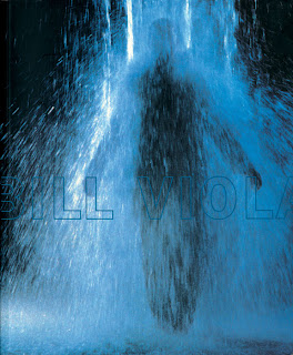

Bill Viola Exhibition Catalogue for the Whitney Museum of American Art. Front cover. Des. Rebeca Mendez

2) The monograph of self interpretation.
The design of a book is a self regarding project to undertake - like a mirror. David Carson is a classic example of self interpretation, using type as a material to play with. It may look aesthetically pleasing but does not show subject and purpose of a magazine.
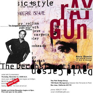
Poynor says that he thinks Sagmeister are current stars of today and that Die Gestaltung Verlag like to take chances on young designers producing monographs.

3) The monograph as self documentation.
Document work has great thoroughness and clarity, or should have this anyway. Paula Scher is not an experimentalist and produced 'Make it Bigger', which is a great example of self documentation. You start to feel what the work is like. Clear and intelligent.
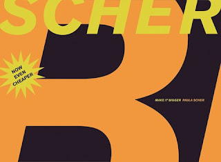
Paula Scher "Make it Bigger".Princeton Architectural Press.

4) The monograph as independent study.
Some spreads can look old fashioned and plain. Poynor suggests the use of smaller books, as they're less expensive but still get the point across. They are small impressionistic overviews and are working commercially.

5)The future of the design monograph?
Poynor says the time that is put in to create a monograph is no worth the money that is given for it. If it is not a success then publishers lose money. He expresses how he thinks Irma Boom is a strong and determined designer. Abstract details do her immersive quality, and is a justification in an Art book.
Otto Trueman, Spread of pages. Des. Irma Boom.

In a monograph it is important to strike the balance between editorial purpose and design as an expression. Wim Crouwel designer gives an example of a good monograph, with two big images and then a smaller one to reinforce the point.

What have I learnt from this lecture?

That it is very important to get it right when it comes to designing monographs. When creating editorials and the subject and text should be clear, then it should not be messed with too much. By Poynor showing examples of successful monographs in his eyes as well as the not so successful ones, it has given me a better idea of what to do next time I design an editorial or spread.

Thursday, 12 March 2009

Mario Sanchez

Mario Sanchez is a young artist, born in 1985 he says on his website (http://aegis-strife.net) "I am young, but I'm not stupid)
A fine arts graduate, he currently lives in Spain and studies illustration, he is well-known for his photo manipulations.

He uses a variety of different mediums, like for example digital painting, vectors or 3D. Sometimes he starts work on Analogue formats and finishes them in digital, or vice versa.

"His habitual line features hyper realistic together with surreal and contemporary dark art touches" (http://aegis-strife.net)

I'm a big fan of surrealism, and Salvador Dali. So when I came across Mario Sanchez' work on www.smashingmagazine.com I instantly became a fan. I could look at these images for hours. I think when I go into the graphic design industry I will probably use surrealism as an inspiration, and I would look back at artists like Sanchez as an influence on my work.


"The Carnival is over." Happiness leaves a wasteland.
"Monument of Non Existence" collaboration with Oana Cambrea

Reality Clash.

Alberto Seveso

Alberto Seveso is an Illustrator/Graphic Designer from Rome, Italy. I like how on his website ( http://www.burdu976.com/?page_id=2) on the "about the artist" section he says "Does not really matter who I am or where I come from, the world has no borders. My illustrations speak for me." I find this strange but appealing as he is basically saying it is not about him, it is about the work. It makes me think that he is very passionate about his work and fills it more with a mysterious vibe. Here are examples of his work, I think they are amazing.


A me mi piace la gnocca!

Design Practice Project

The project that accompanied the Blog for Design Practice was a 5 week project that involved team work and logo design and application.

Initially we had to think of an event and location that had strong visual imagery and combine the elements to create a logo.

We decided that our event but be a British Blood Drive, as we knew this had been a big thing in America and the UK did not have this, however people did Give Blood but on the website (www.blood.co.uk) they say there is still great need for people to give blood.

Our location we decided would obviously be the UK, however being an ambitious and vast location we thought we could make it work.

The logo took a lot of time, and we came up with many different versions. We decided on the Union Jack with the red missing (representing no blood), but then we decided to keep a bit of red in at the bottom to show that there is blood, we just need more of it.

Here is the logo development:


When it came to applying the logo to different types of medium, we researched into artists work and gained inspiration from an artist called Felici Verini who painted shapes on walls in different places so at a certain angle it would visually look like a whole shape.


We then started to design billboards that would show the meaning behind the logo, which was to show the Union Jack filling up with red (the blood). Our idea was that the billboard would change depending on how well the blood drive was going.


We then were trying to think of ways to develop the campaign even further, and decided that as this is the British Blood Drive then we could use British icons to get our point across. These included the red bus and British roads, we thought these worked the best.


Applying the Blood Drive idea to merchandise would involve a clever idea so we didn't apply it to everything and push the idea too far. We tried many things including guitar pics, memory sticks and mugs but I feel the 'Blood for Life' printed on a 'Bag for Life' was by far the strongest idea.


I found the whole project tough but rewarding. In the final weeks of the project we had pitch our ideas in the style of a formal presentation, that was assessed. As public speaking is not my best area I found that the more I do the confident I am doing them, and I felt a massive improvement in the Blood Drive presentation. If I could go back I would take certain ideas out that I felt pushed the campaign too much and also develop and refine the logo - which I still plan on doing when I have the time.

Studio 8

Studio 8 is an award winning independent graphic design company based in central London. They are one of the graphic design companies that I have researched into on the Internet (www.studio8design.co.uk) and whose work has caught my attention the most. When looking at their work I don't just see clever ideas but visually the work looks strong and dynamic. Here are a few examples of my favourite pieces that they have created...


Asked to recover the critically aclaimed 'The Art Atlas'
Posters created named 'Breathe' to raise awareness of the destruction of the Amazon rainforest.


Studio 8 commissioned to design an annual report of 'Circus Space' in 2006

Tuesday, 3 March 2009

True North

I wrote to True North, and I'm really glad they found time to write back to me.

My Email -


To True North

I'm a Graphic Design degree student in my second year, and I'm really interested in going into this area when I leave University. I was looking through many design companies websites and I came across yours. I found myself on it quite some time checking out your recent work, and I really liked your ideas and visuals. I was just wondering if you could answer some questions when you've got the time just so I have a bit more of an idea what to expect from the design industry for when I leave University.

1) What are you looking for in particular when browsing through portfolios?

2) What are you looking for in particular within the person that is showing you their portfolio?

3) How many people work for your company? Is it quite big or small?

4) Do you take on people for works experience placements or would you prefer people who come to you who have already had a placement?

5) How do you go about coming up with the idea that works? Do a group of you brainstorm together or do you go off individually then come back with what you all have and discuss it?

Thank you

Katherine Speak

BA Honours Design and Visual Arts: Graphic Design

Stockport College

Their Reply -


1) What are you looking for in particular when browsing through porfolios?
Great Ideas, ability to rationalise your work.

2) What are you looking for in particular within the person that is showing you their work?
As above. I want to see a personality and a point of view or opinion.

3) How many people work for your company? Is it quite big or small?
Medium sized - about 16 people.

4) Do you take on people for works experience placements or would you prefer people to come to you who have already had a placement?
We do take on people with placements.

5)
How do you go about coming up with the idea that works? Do a group of you brainstorm together or do you go off individually then come back with what you all have and discuss it?
Bit of both. Depends on the time and the project.

alan.

Alan Herron
Creative Director


Fourways House
57 Hilton Street
Manchester M1 2EJ


Monday, 2 March 2009

Design - its taking a hold.

Since starting the degree, I got told on various occasions that Design should be your passion, doing it as a degree subject and it being a potential career choice should mean that you should see it everywhere, you should start to notice it in magazines, books, on the television. Everywhere you look you should be taking it in, embracing it!
Im going to be honest..this never really happened to me up until a few weeks ago.

Everytime an advert comes on the t.v. I immediately imagine how the art directors and producers discussed, then went on to come up with the idea. All the hours/days and even weeks of brainstorming... and then how they might have pitched it to the company.

Then I saw this advert for cadburys, and wondering how they must have pitched their idea.

"So there are these kids..."

HOW THEY PUT THIS IDEA ACROSS WITHOUT SOUNDING JUST A BIT LOOPY MAKES ME THINK THEY MUST HAVE HAD AN IMPRESSIVE PITCH.


Its an advert you either love or hate, but as a concept I think is one of a kind, I think it works.

Whilst on the subject of clever typography...

As I've just mentioned, Glorious used tools and appliances to create a font that they used in the campaign 'Make me C'.

I was on Googles search engine and noticed a change..and are now using cartoon characters for their typography!


Cool eh!!

Glorious came to visit

On 26/2/09, Glorious, a award winning design company came to visit and showed us their work. They have done work for the Tate and North West Enquirer. I liked all their work, and these works in particular stood out to me.


Karl's Barbershop

The owner of one of Manchester's last traditional gentleman's barbers wanted something special when celebrating 40
years in business.


I thought this guerilla/ambient media was a really good idea, when you pulled it out the part in the middle looked like it was spinning, like the symbol that is placed outside a barber shop does.

The font for 'reddog' caught my eye. It shows that to create a successful logo it does not have to use professional typography, you can just place an existing font in illustrator and draw around it, to create this font


and this logo


Lastly, their 'Make me C' campaign using typography out of tools and appliances I thought was really impressive. The typography is unique and each tool for each letter really works, here is the logo that Glorious created.

My first reply

Today, I sent off several emails to design companies that had caught my eye whilst browsing through their websites.

Even though the reply I got back from 'Like a River' was short and sweet, and didn't answer my questions, it was still a reply. So Im putting it in my blog!!


To Like a River

I'm currently in my second year of a Graphic design degree course at Stockport College, we have just finished a corporate identity project that involved creating and developing a logo then applying it through advertising and guerilla/ambient media etc. I have been looking at your website and I enjoyed looking through your work.

As the Graphic Design world is the area I would like to go into when I finish my degree, I was just wondering if you had some time to spare, you could answer a few questions, so I have a better idea what to expect from Design industries when I leave.

1) Do you look for something in particular when browsing through porfolios?

2) What are you looking for in particular within the person that is showing you their portfolio?

3) Do you take on people for works experience placements or would you prefer people who come to you who have already had a placement?

I'd also like to ask a question about tackling a brief, as sometimes I can sit for several torturous hours brainstorming and still not being able to crack the idea. How do you go about coming up with the idea that works? Do a group of you brainstorm together or do you go off individually then come back with what you all have and discuss it?

Thank you

Katherine Speak

BA Honours Design and Visual Arts: Graphic Design

The Reply

Hi Katherine
Thanks for your enquiry.
Best bet is to liaise with Steve Jones as every now and then we arrange for a group to come in from Stockport and that seems to work out ok for everyone.
Ta Rob


On 2/3/09 15:00, "ktspeak@aol.com" <ktspeak@aol.com>


----------------------------------------------
Like A River Brand Agency
1 Alpha Place, Jordan Street, Knott Mill,
Manchester M15 4PY.