Thursday 5 February 2009

Pictograms

"Maximum Meaning, Minimum Means." - Abram Games

Pictograms are simplified or stylised pictures of people or things. Its aim is to increase the efficiency of the communication of a picture, in this instance someones face, by achieving a physical likeness with the characteristics and eccentricities.

For mine I drew myself and Abz. As well as Abzs head scarf that is iconic I thought that her eyes stood out as well, so I came up with this illustration.


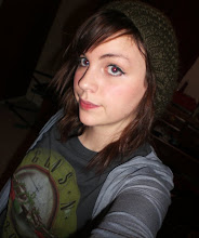
With my own face, I thought the characteristics that stood out the most were my chin and my lips, so I came up with this.


However, I thought that each picture could be simplified even more. I thought with Abzs picture I could change the type of brush I used on illustrator so it looked less 'drawn'. I also thought I could take her eyes away and you would still be able to tell it was Abz.


For my picture, I thought I would add more block colour as it looked too much like a line drawing. I also decided to take away the lines that made up the shape of my jaw, as you could still tell it was me with my hair and my lips.

Thoughtfuls' Guide to Pitching

As part of our design practice me and my group have to present our work and pitch our chosen ideas to people. As this is quite new to us Thoughtful came and talked to us and gave us a few handy hints to deliver a successful pitch.

I think it is important to remember that the Advertising buisness is exploitive and THEY tell YOU what to change, which I think would be quite difficult when you've spent weeks working on an idea that you personally really like.

Additionally, pitching is not a competition, it is a way of getting closer to your client.

Something that I think I will definitely have to work on in the near future is to ask more questions when I am presented with a brief, even if I don't have any particular question in mind. This shows the client that I am interested in what their company and what they are asking me to do.

Some more key information I thought was important was:

1) Do a Cover sheet

2) Break your ideas down

3) Show how it is flexible

4) Rehearse presentation and make shaw it is flawless

5) End with a Thankyou

6) Be ready for questions (Do your research!!)

Wednesday 4 February 2009

Graphic Design: Fine Art of Social Science?

In a critical studies debate on 28/1/09 we discussed whether graphic design was a fine art or social science using a text by Jorge Frascara as a source. By reading what Frascara had to say and by taking it in objectively I came up with these points:

1/ To be a good graphic design is has to be appropriate to the context and communication in all areas.

2/ Graphic design should be discussed in all visual styles, not just posters and books.

3/ Graphic design needs to communicate with the public with its ideas and issues, it should not just aesthetically please.

4/ Modern avante guarde typography is an example of how typographic deisgns during this period were more abstract and aesthetic that communicating its ideas and being appropriate.

I came to the conclusion that in order to succeed in its aim and communicate ideas then Graphic design is not or should not be a Fine art.

Barcelona movies

In November 2008 we traveled to Barcelona on a University trip. As well as taking in the sights and exploring the City we were set a task to embrace the Spanish culture by making several short movies of what we observed if their culture whilst there.

On my first evening in Barcelona me and my friend Grace decided to walk to the Docks. When we got there the scenes were picturesque as the sun was just about setting and the hundreds of yaughts created a breathtaking sight. This seemed to be the perfect subject matter for my first movie titled 'The Docks'. Over the next 4 days I made return journeys to the Docks to see what different aspects of culture I could film. The cable cars would be a big part of the Barcelonian culture as there were two transporting people to places all over the city. I felt the ending scene of 'The Docks' captured Spanish life perfectly as a woman watches her child play with the birds, and to my eye it looked like this was something they might had done often.


For my second movie titled 'The market and the museum', I used these two places together as certain things that caught my attention from the museum could be linked to things I observed at the market. For e.g. The head made of fruit and the fruit market. The very surreal museum that we had visited (that I cannot remember the name of but it was near the Docks!) began by a walk-through wardrobe that led into a wide hallway that had a variety of random and strange objects on tables. This also linked with the market as it held many stalls with a variety of different spanish foods of all different textures and colours.


My last movie had no backing soundtrack as I thought it did not need one. The movie shows a very surreal street act, one of many, however I thought this one was the most surreal. I cannot really explain what it was about, but it was very entertaining, so I think I will just let the movie do the talking for me. Enjoy!